This section is a collection of the digital art and graphic design work I’ve done for work, school, and personal endeavors.
Slender James Classic 2026
Cedaero
2026’s Slender James Classic Vintage and Rigid Enduro Race’s theme was As Seen On TV. Once again theming our bike race after an obscure all-staff niche interest - Infomercials. The entire Cedaero team has a strange fondness for catchy commercials and strange gadgets that were repetitively advertised in 30 minute segments between public access programming. Our mutual enjoyment for the Magic Bullet commercial inspired this idea back in early 2025 but we weren’t sure if the world was ready for this theme, so we saved it for 2026.
This year I made the poster collaboration with Karl again, I set up the base and he added the television schedule info block and the bottom logos/text. I really wanted the poster to instantly read as a recognizable package/commercial and I know the ShamWOW guy’s pose with the towel is an easy one to recognize. I took Vince’s body and put Slender Jame’s head on it. I also gave Slender Jame’s a Q-Ray Ionized bracelet because wtf were those?? The poster’s layout is inspired by the original box that the Magic Bullet personal blender came with because well, that was the whole inspiration for this theme and that was my personal favorite TV gadget.
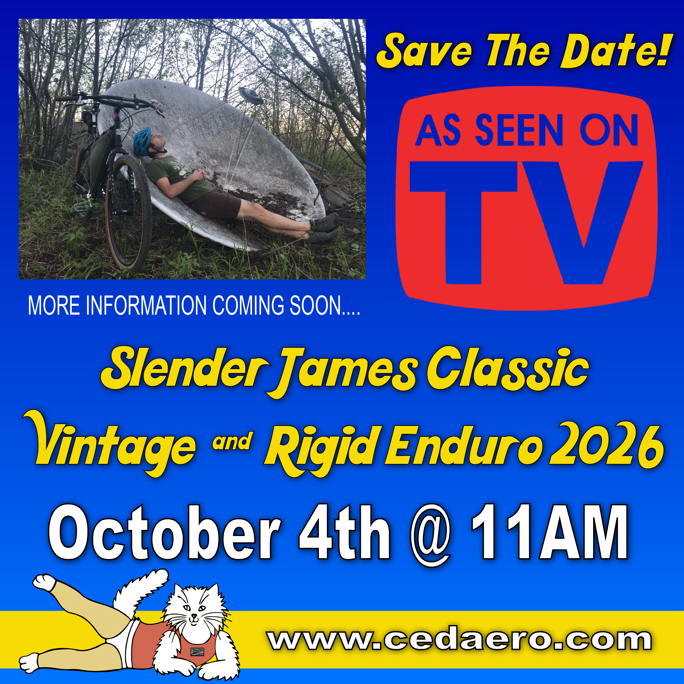
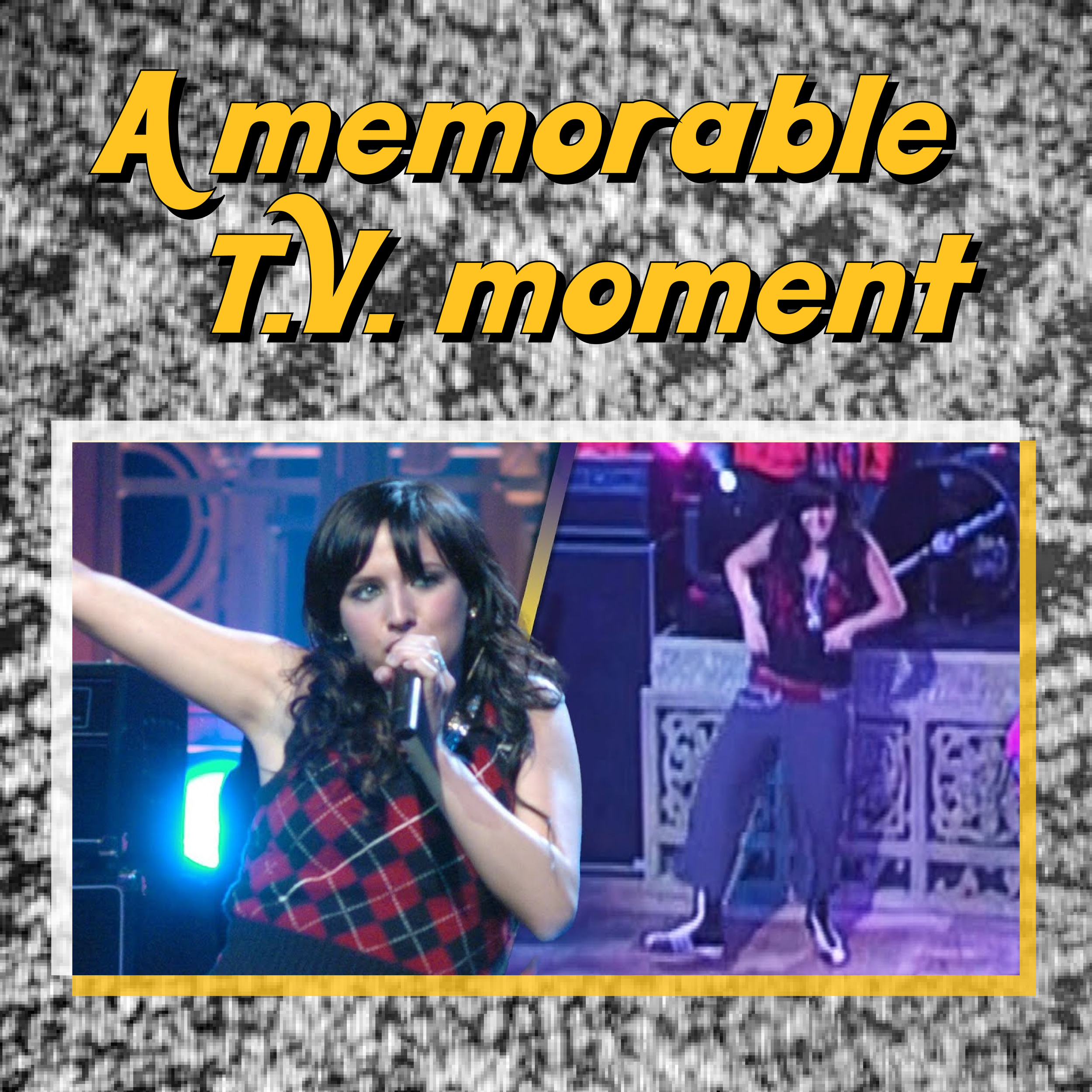
I also made a teaser image based on the “order now” pages at the end of normal product commercials and then I made a “what to wear” image carousel for Instagram to give our attendees some ideas on what to wear. While we started this as commercial inspired, anything from TV would “count” as a costume idea!
I also did another printed product this year, but with mixed results. I did another linoleum cut out of Slender James’ face in a TV, mimicking the As Seen On TV logo, and printed it in white on red Cedaero Twisted Zipters. We do another acrylic paint block print on another similar fabric so I thought these would turn out okay but the fabric we used was nylon instead of polyester and I think the linoleum sucked up too much of the heavy body acrylic paint, so these prints didn’t turn out AS good as the other block prints I’ve done on Xpac fabric, but you live and you learn.
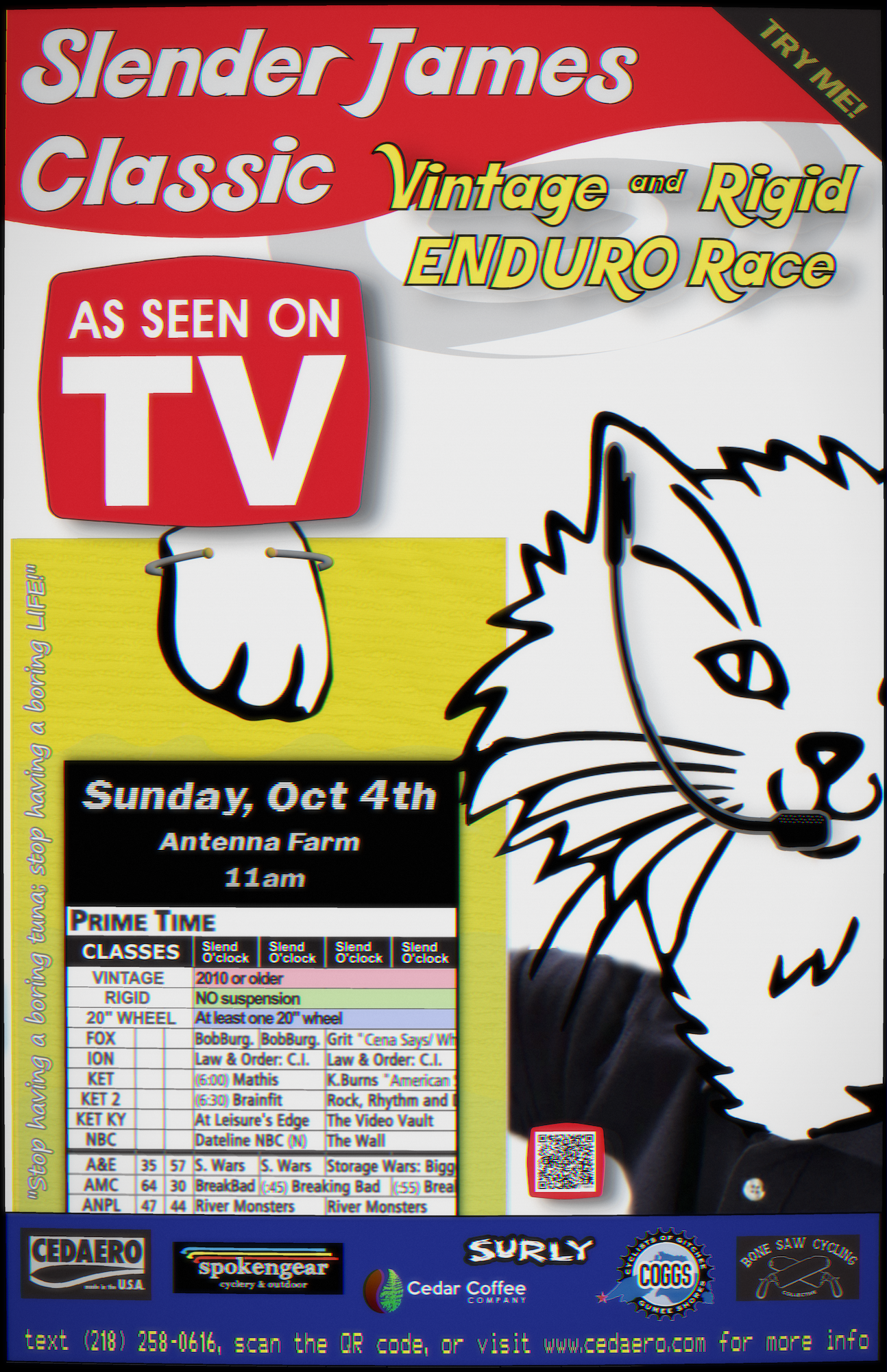

This is a placeholder image until I snap some photos of the actual print I did… This is just the backwards digital graphic I used to trace and carve the actual block.`
Slender James Classic 2025
Cedaero
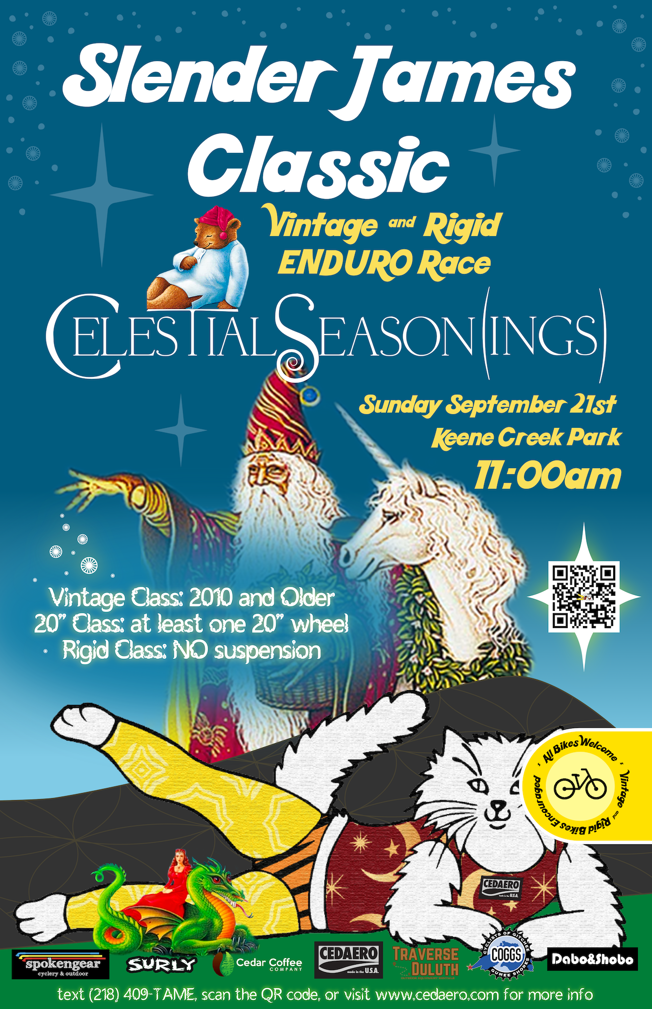
2025’s Slender James Classic Vintage and Rigid Enduro Race’s theme was Celestial Season(ings). Yes, we themed the bike race after the popular tea brand, but only because we are a group of people who love good packaging and Celestial Seasoning’s tea boxes have some of the coolest art (and their older commercials are kind of insane if you watch them at ½ speed.
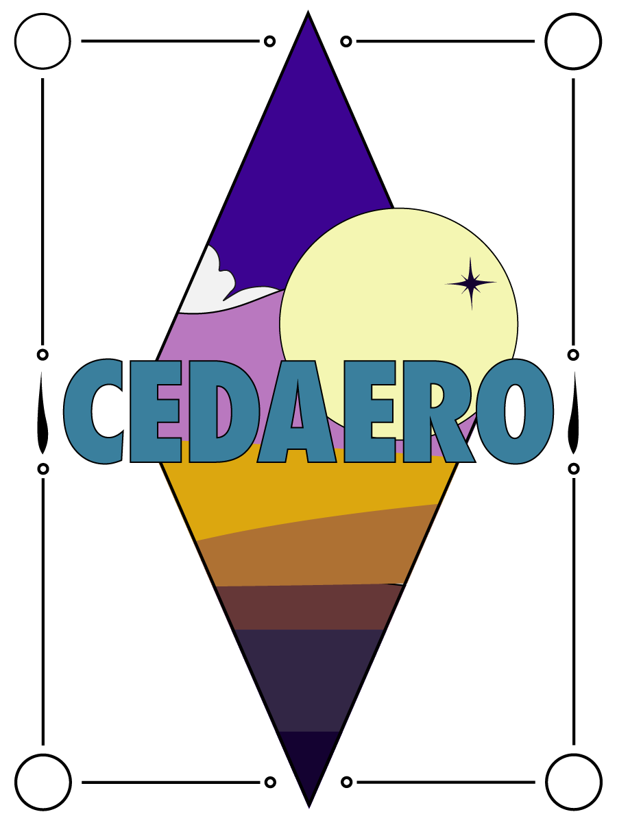
For the poster, I basically took all of the popular characters and placed celestially-clad Slender James right at the front of a large Flower of Life mountain. All of the stars and tiny bike wheels add similar flair to that of the tea boxes. My favorite part is the yellow logo which references the waste-free marketing of the newer produced boxes of Celestial Seasoning’s tea. And of course, Karl added the finishing touches at the end making this a collaborative effort such as the wizards little hand flair and the glow/text design of the bike classes.
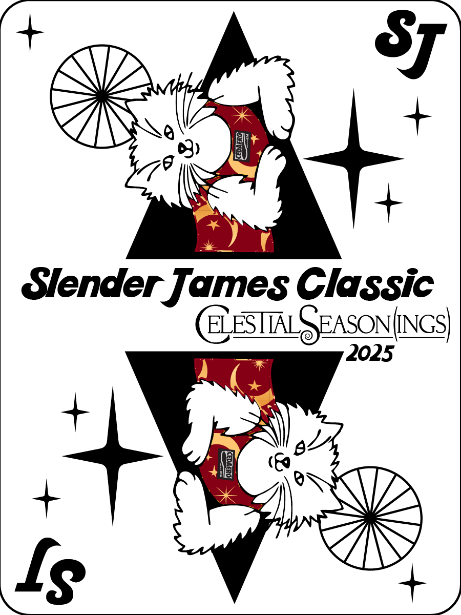
I also took the opportunity to make spoke cards as they are a popular flair item in the cycling community. I modeled it after playing cards of course, and edited our existing colorful “mountains” logo into a diamond.
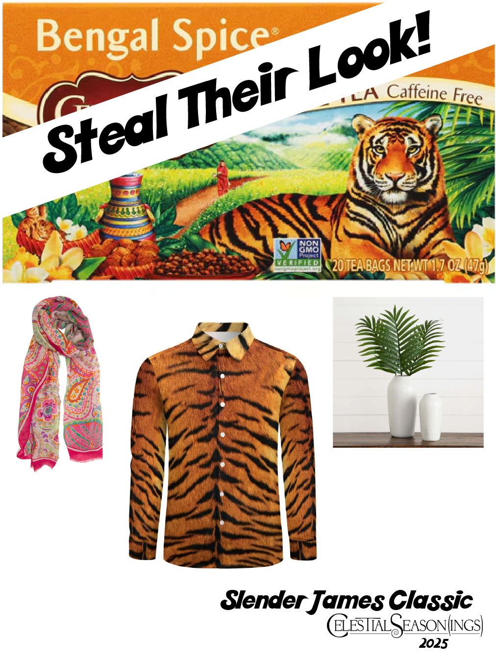
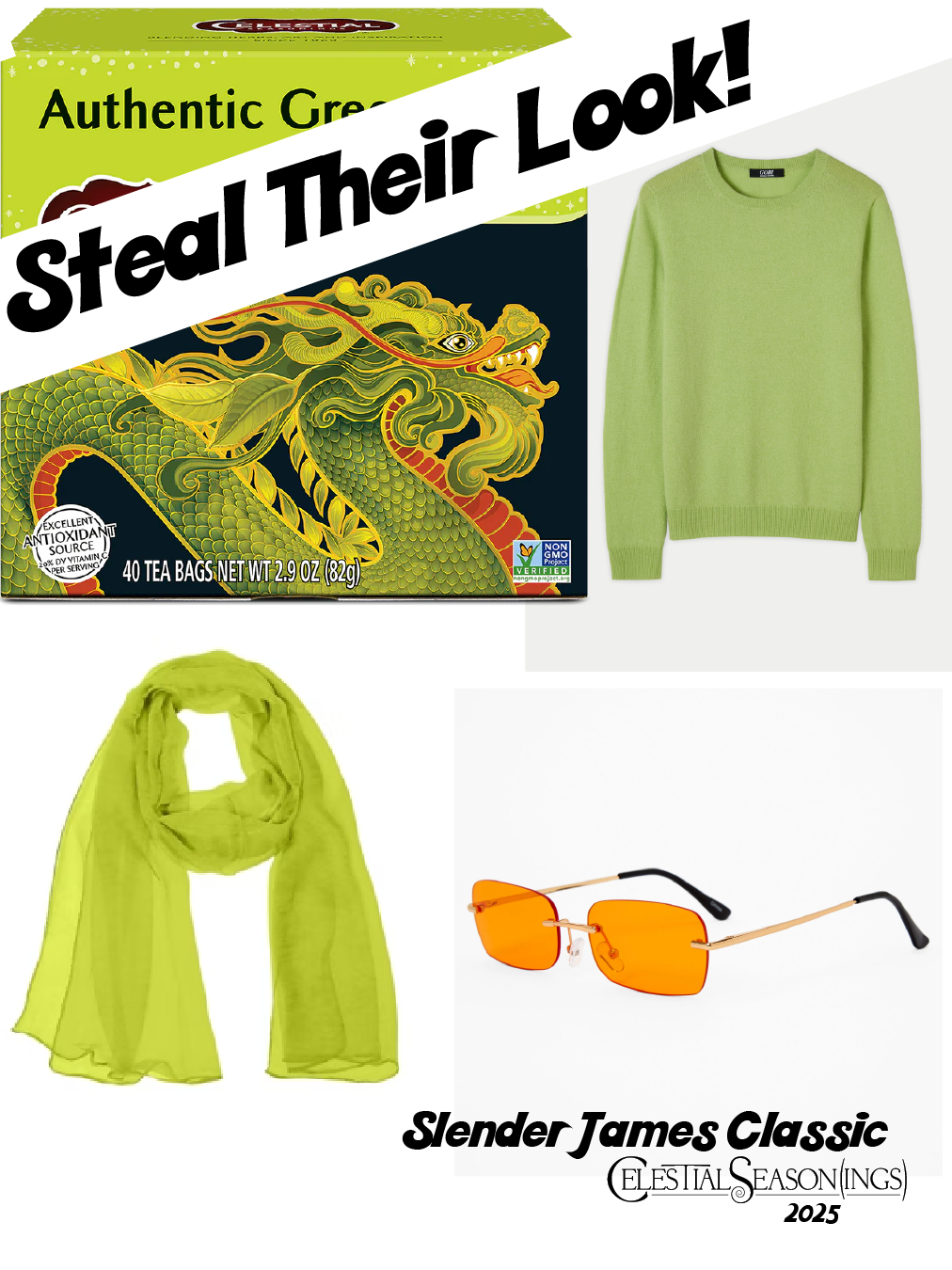
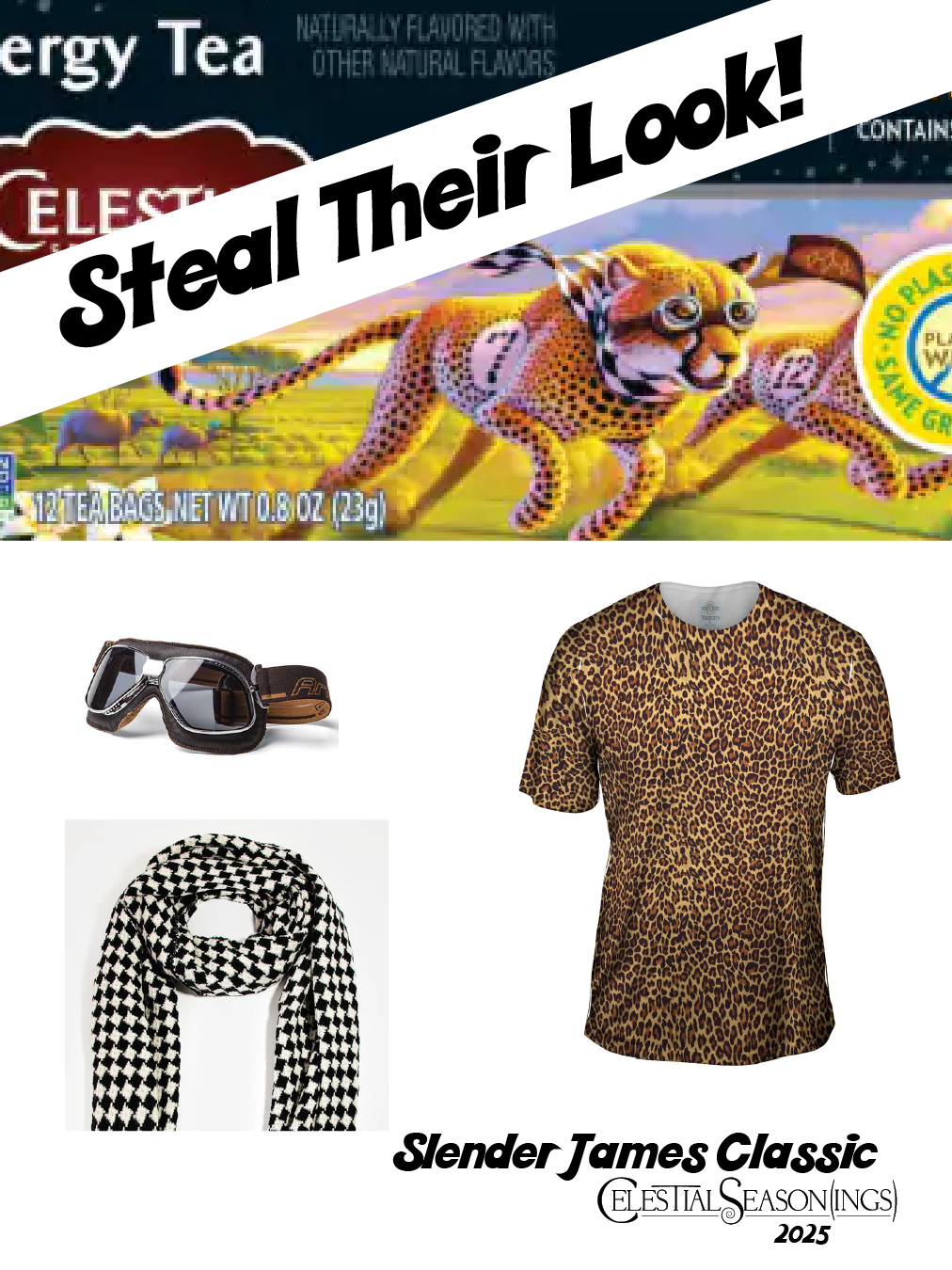
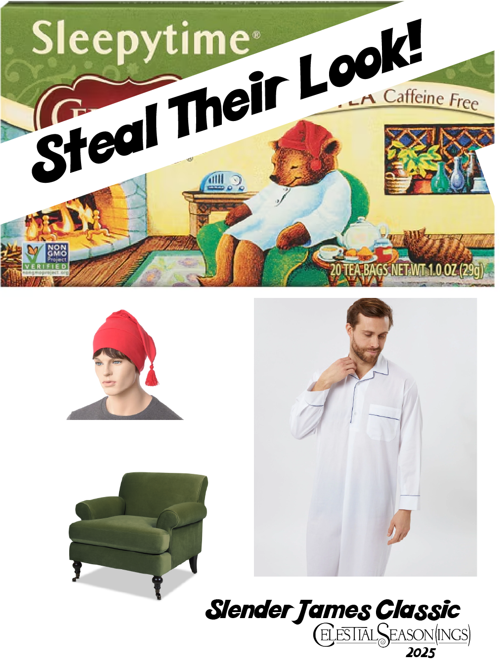
I also made a “what to wear” image carousel for Instagram, which was extremely helpful for our attendees it turns out!
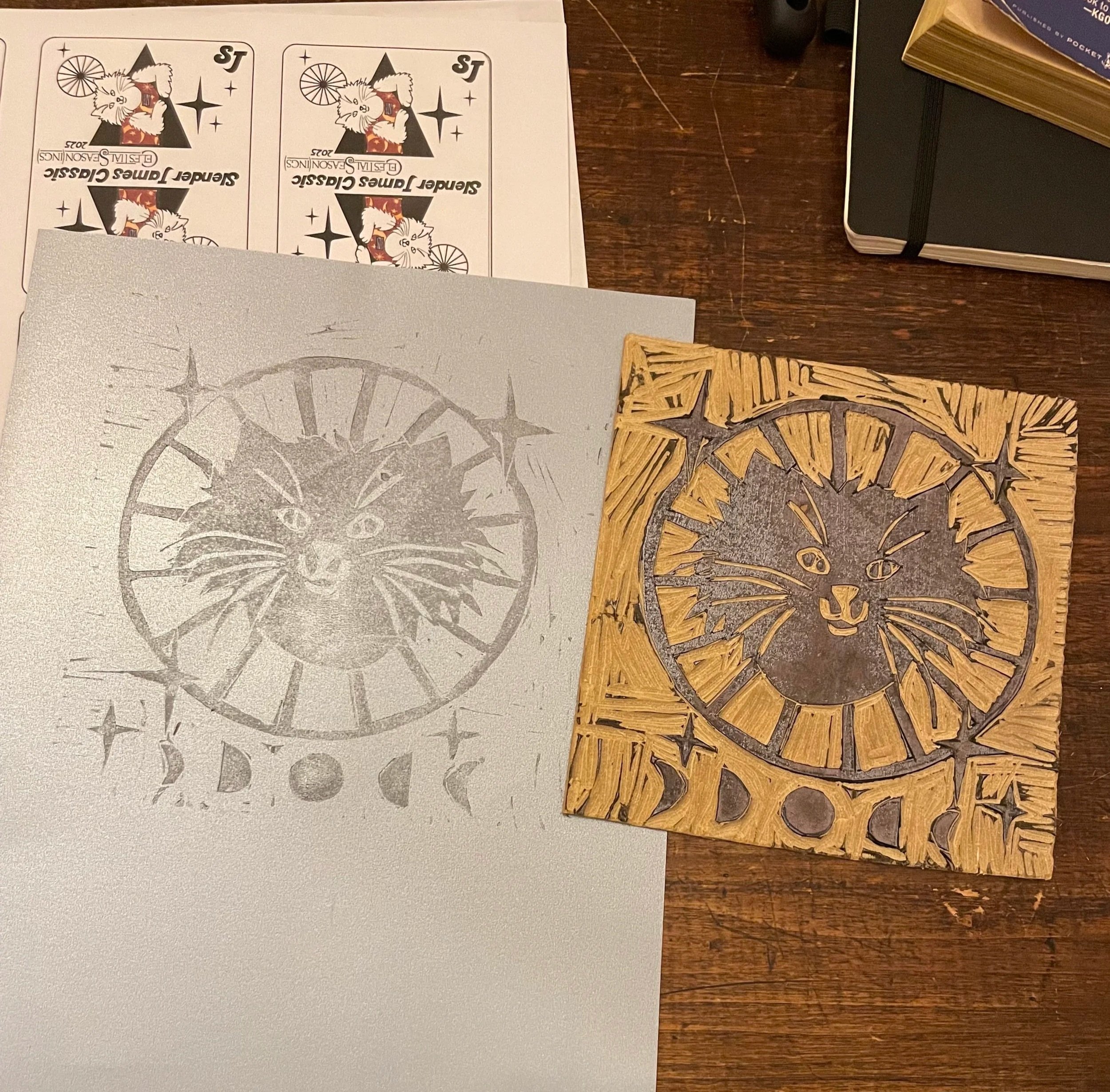
Last, the CEO of Cedar Coffee Company/Cedaero/SpokeNgear asked if we were doing T-shirts this year, and on the Monday before the race I thought - “I do have some linoleum and printing ink… let me see what I can come up with” and whipped up this graphic, spent two days carving it, and block printed 25 T-shirts the day before the race. I’m pretty proud of what I came up with this year.


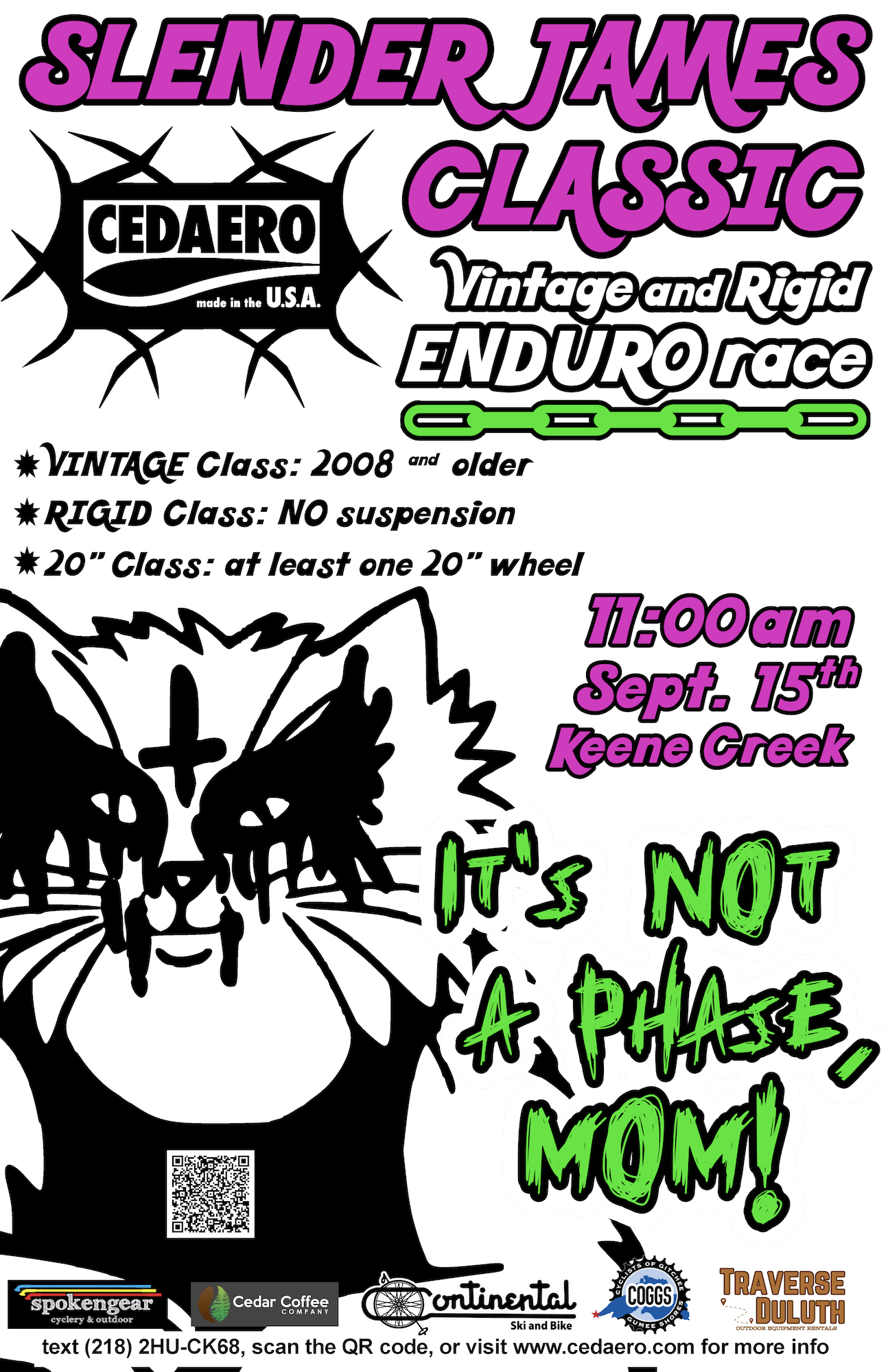
2024’s Slender James Classic Vintage and Rigid Enduro Race’s theme was IT’S NOT A PHASE, MOM! I think we mainly wanted to go with this theme because of a minor obsession with Evanescence’s song Bring Me To Life. But we also wanted to tap into the “blunder years” and harken back to when we were confident awkward teenagers. I was finishing up my time doing marketing coordination for another company, so the assets I made for this year were minimal, but I’m still proud of the format change I applied to the poster and using my newfound Illustrator skills.
Slender James Classic
2024
Cedaero
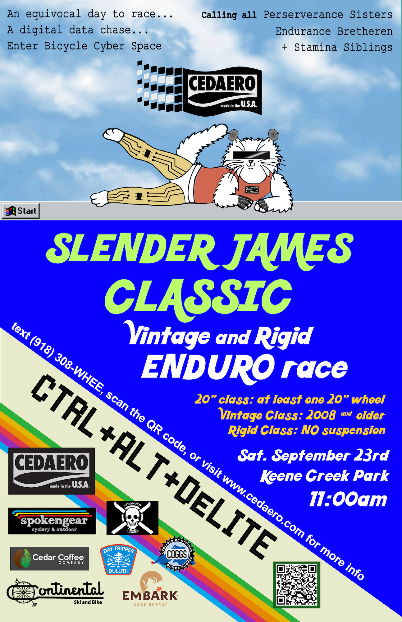
2023’s Slender James Classic Vintage and Rigid Enduro Race’s theme was CTRL+ALT+DLITE. We wanted to do a cyberpunk style theme where we embraced technology new and old. Here are some assets I made and/or collaborated on to promote the event.
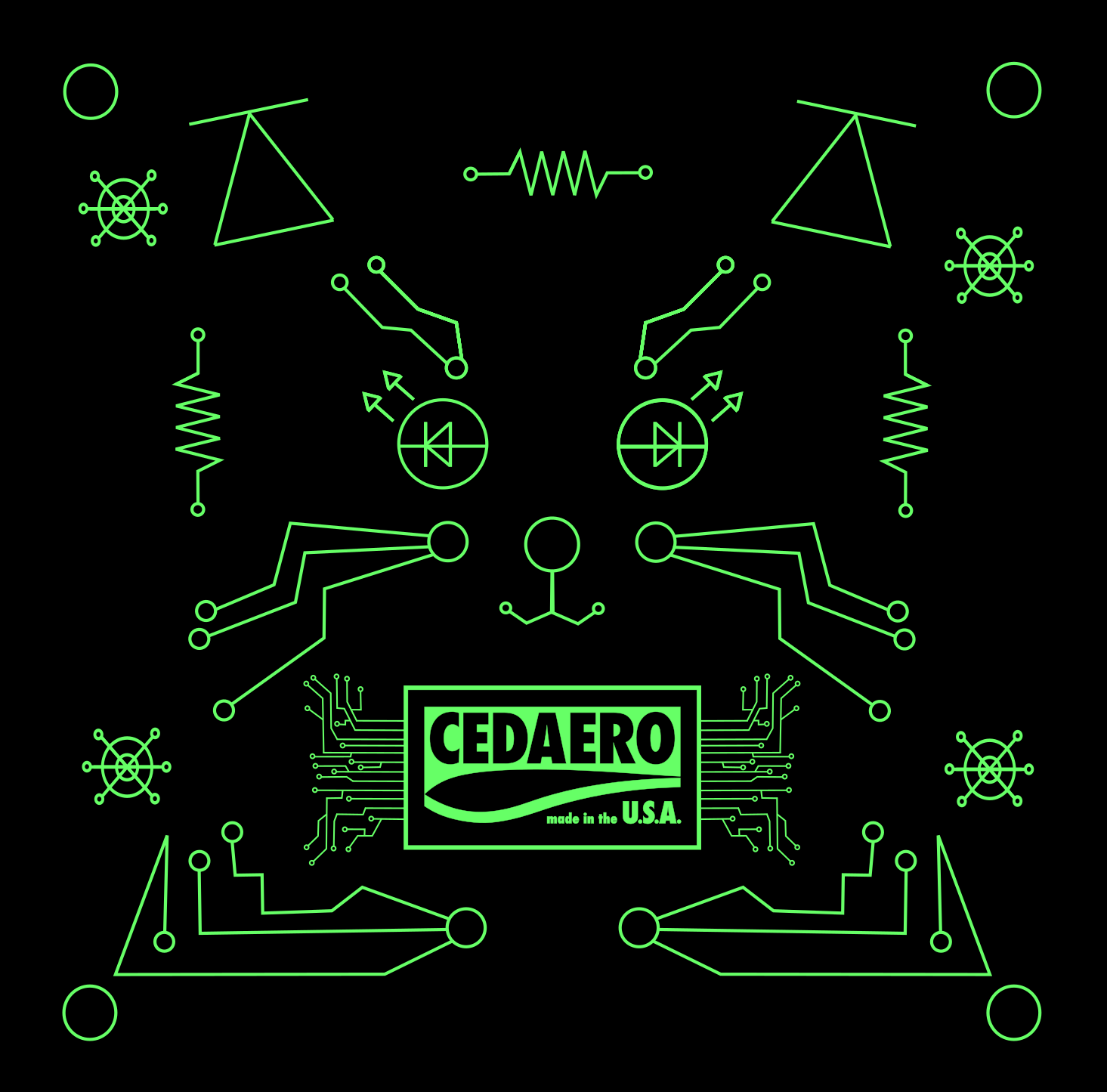
I made the poster this year based on the format that my coworker Karl had established, created Slender James’ outfit, and created the Cedaero logo at the top, stylized after the Windows 95 logo. I also created a T-Shirt heat transfer transfer decal, which I then applied to black t shirts to give out and sell at the race.
Slender James Classic
2023
Cedaero
A poster project revolving around exploring hierarchy and concept design through creating a poster for a real or imaginary event of our choice.
I decided to make a poster from my cat’s point of view, and came up with the imaginary event Chicken for Dinner. The poster features a digitally traced and filled in image of my cat Spritz, and outlines the timeline of events which are involved in having chicken for dinner.
I’m over all pretty happy with the design and received mostly positive feedback. I feel this piece shows my creativity and passion for humor in both subtle and obvious ways.

Chicken for Dinner
2024
2D Digital Design
University of Minnesota Duluth


A project of your choice that exemplifies your creativity and new digital design skills.
For my final project in this class I wanted to create some images that might be a part of a clothing line under the name of my artist/design collective name - Garbagequeen9000 and Garbage Quality Productions. It was here where I came up with what is now my GarbageQueen9000 logo and I’m really happy with that. The Disappointing Stepchild design came out from my own feeling of being that, but wanting to create something in somewhat illegible “metal” font but also made innocent and girly by framing it as a butterfly. The TOOL shirt came from our Album Cover project. I loved the editing and the imagery I came up with for that project, and I love TOOL so I wanted to make that into a t-shirt. I have a total of 8 designs for this project but the ones I have displayed are my best work.
Overall I’m happy with some of the designs but I feel I was tight on time and a bit uninspired after creating a few. I think if this was for a more advanced class or a printmaking class I would have put more time and effort in but I’m happy with what I came up with in the end.

Garbage Queen Design Line
2024
2D Digital Design
University of Minnesota Duluth